
INTERVIEW: Keith Draws Shares the Secrets of Sci-Fi and Superhero Illustration
A doodler from an extremely young age, encouraged by the freedom to do as he pleased at school, Keith Draws has been an artist at heart for his entire life. Inspired by the sci-fi, fantasy and superheroes that amazed him as a child, he has gone on to create art for bands, books and games.
With a new sci-fi novel series proudly displaying his artwork on the covers and a crowdfunded superhero anthology in the works, Keith is more in demand today than ever before. He has mastered the art of telling a whole story in just a single frame, using shape and colour and detail to create intriguing and captivating pieces that draw you into everything his named is attached to.
We spoke to Keith to find out how he developed his skills and where they will take him next.
Kirstie: How did you get into art?
Keith: Drawing and painting is something I always enjoyed but it became something more when I started school. At the time the school were running an experiment (it was in the ‘60’s). The whole infant block was open plan and the idea was that kids could enter and leave any lessons they wanted to at any time. So of course, I would wander off and draw pretty much all the time. It’s all I remember doing for those two years.
When I was eight years old I moved to the junior block where they had actual classrooms. This was very different and of course at first, I just wanted to draw all the time. Well I say at first, but it was pretty much a feature all through my school life and I often found myself in trouble because of it. Often times I was given the option to draw or take part in the lesson. When my mum asked the teacher about this, he said that I was disruptive because I asked too many questions and so he let me draw instead.
This meant that by the time I was twelve years old my reading was so poor I needed special tutoring. This was done by a wonderful lady who questioned me about what kind of things I enjoyed and proceeded to find books that would keep my interest. These were science fiction books and that really helped focus my interest into that area.
Within six months my reading was excellent and school became a lot easier for me and though I still got in trouble for drawing in class, I did a lot better. At around the same time I discovered super-hero comics and spent a lot of time learning to draw in the styles of my favourite artists.
 Kirstie: Who were your earliest influences?
Keith: Well it probably began with many comic artists. Mainly John Buscema and Gene Colan for their drawing and Alfredo Alcala (for his inking). By the time I was fifteen I had discovered people like Ronn Cobb, Roger Dean, Rodney Mathews, Brian Froud, Alan Lee, Chris Foss, Frank Frazetta and many more who populated the fantasy and science fiction realms of the time. I’ve been very fortunate in the last few years (thanks to my art), since I’ve become friends with Jim Burns, Christos Achilleos and Peter Andrew Jones who would be right at the top of that list of influences.
I also spent a lot of time in the Manchester art gallery on Portland Street which is the home of a great deal of wonderful paintings, including many pieces created by the Pre-Raphaelites and quite a few pieces by Sir Lawrence Alma Tadema.
From being 12 years old I attended an evening art-class with a lovely old gentleman whom I only remember as Mr. Lee. He was a talented watercolourist who painted landscapes of the peak district and he taught me a great deal and gave me a real appreciation of the world around me. At 13, I began attending a Saturday morning art-class. There were two tutors, Jock McConville and Mike Poole. I should also count these people as big influences since they encouraged me to follow many previously unexplored paths and were very supportive for the next four years.
By the time I was 16 it seemed the only thing to do was go to art college and learn how to become a commercial artist working in science fiction, fantasy and horror, specifically doing book and album covers.
This was where everything changed for me. I was told I was wasting my time working to become such an artist. That there was little to no chance of getting into such work and there was in fact no real market for it unless I was able to get an agent and agents came to you. The tutors all said I should be focusing on more abstract art type subjects which would lead to some kind of future in the academic world.
I didn’t want to do that so, feeling very disillusioned, I switched over to a course on advertising and graphic design, hoping to find more support and more interesting work. I enjoyed the speed drawing aspects and the problem-solving side of that work.
 I learned a great deal about the best ways to attract attention to an image and an immense amount about communication and storytelling with images; so of course I became very enamoured with the world of advertising. This led to a twenty-five-year career, that even included a few years working on store and interior design and layout. I became very successful in the field, but sadly the more success I had, the less drawing I got to do. Finally, when I realized I hadn’t done any drawing for several years but was instead spending most of my time being a “businessman” I decided it was time for a change.
So, I went in to 3D modelling and animation for a while which was a lot of fun and again I had some reasonable success.
This was around ten years ago. We were living in the UK at the time and my wife Wendy was having our first baby. She wanted to be near her mum for the birth, so we moved over to Mexico as a temporary measure but, due to complications during the birth, ended up staying much longer than we intended.
The baby and my wife both recovered okay and I was still able to work just fine thanks to the Internet but it took a couple of years.
Just before we moved there I had purchased a Wacom Cintiq and I found myself very interested in learning to illustrate digitally. I joined the DeviantArt web community and started posting my images on line. Soon after, the banks crashed and things took a turn for the worse. Most of the 3D work dried up (all my clients were going bust) and things got a little difficult.
Fortunately my wife was feeling better now and she decided to take a full-time job as a chef so I could focus on getting new work without us going completely broke. For her this meant working long hours where she didn’t see much of me or the baby. It was a hell of a sacrifice she made and she continued to work right up until the day before she gave birth to our second baby in 2010.
Around that time, I felt more confident working with the Cintiq and so decided to try getting work in comics. I applied for a few jobs in that area and amazingly was commissioned by Twelve Foot Ninja (the Australian rock band) to produce a comic/graphic novel for them, both script and art.
The timing was perfect since Wendy obviously had to then give up work, at least for a few months. And thus, my current career in illustration began.
We also decided to stay in Mexico for the time being since the cost of living was a lot less than in the UK and USA so since we were starting over it made sense. I wouldn’t like to move now since it’s become home and I love it here.
Anyway, I got kinda side tracked a little there. We were talking about influences?
 Kirstie: Who are your predominant influences now?
Keith: Well these days I’m really trying to speak with my own voice but at the same time I have to admit I’m still influenced by the people that put me on this path in the first place and of course I’m coming across new influences every week.
There are some amazing concept artists out there like John Wallin Liberto (Halo 4 concept artist) and Michael Kutsche (John Carter movie concept artist) and many more. I’m also very inspired and encouraged by Todd Lockwood (Dungeons and Dragons) and Liam Sharpe (Wonder Woman artist 2017), both of whom I’ve gotten to know in the last five years. In fact, Liam encouraged me right from the start of my new career path (even though things were not easy for him at that time either) so it’s only fitting that the work I’m doing on “Era: The Empowered” right now is heavily inspired by his recent work on Wonder Woman.
Kirstie: What is your favourite material to work with?
Keith: Well, if you are talking about production materials, I’m a mixed media guy. I tend to use whatever I can get my hands on, from charcoal and pencils to water colours, acrylics oils, inks and well, anything really. I’d like to spend some time working with oils to really develop some better skills in that field, however the one thing that really appeals to me with any medium is if it makes it easier to work fast. This is why I find working with digital media very satisfying.
I often use 3D applications such as such as Lightwave, Vue, zbrush and Max to create reference images and 3D is excellent for setting up lighting reference in complex images. I draw and paint with Manga Studio and Coral Painter X3. The nice thing about working digitally is I can keep my prices low enough so that independent authors and creators have access to my work while I’m still making a decent living.
I do feel I owe that community a great debt since without their support I would not be doing this now, so I always try to work with their budgets and offer free advice on marketing and advertising if they need it, since I do have some experience in that field.
Now if by “material” you are talking about subject matter, I love anything that’s challenging and you usually wouldn’t see in real life. I love to make the unreal real while at the same time telling some kind of story. This is probably the most consistent theme in my work.
 Kirstie: If you could design the poster for any movie, what would it be? What would your design be like?
Keith: That’s a difficult question. If a movie were to be made of Larry Niven’s Ringworld, I’d love to do a poster for that. As for what that poster would be like? I suppose I would be influenced by the great Drew Struzan since he is probably my favourite movie poster artist.
However, saying that, I think movie poster design has, for the most part anyway, stagnated, and many modern posters follow the formula so well developed by Drew that it’s become somewhat overdone, so I’d probably try to take a different approach while attempting to capture the impact and emotional engagement Drew always manages to achieve. I think it’s important to keep pushing the limits of design and illustration so that I can keep growing as an artist.
I’m not sure how it would look in the end, but I’d aim to do something that really captured the public interest whilst being unlike anything they’ve ever seen before.
Kirstie: What is the first piece of work you were really proud of?
Keith: That is probably the Twelve Foot Ninja Graphic Novel/Comic since it represented a major step into the world of fantasy sci-fi and horror illustration for me. I feel it was the time when my own personal style really began to shine through. It was also, at least for me, an incredible achievement in its own right, since it was a pretty substantial amount of work completed in a short time. I feel so honoured that the guys in the band had such faith in me at that time as I really was relatively unknown in the field then.
I’ve been working with them ever since and have worked on a big variety of projects. In fact, just in the last few months I worked on a pretty big project with them but it’s all hush hush right now so I’d best stop talking about it.
 Kristie: How have you changed as an artist since then?
Keith: I certainly hope I’ve changed for the better. I feel I have improved in many ways, and I certainly strive to do that. It’s a difficult thing to judge as you go along, but now when I look back over my older work, I do see things I feel I’d probably do differently now. I learned an awful lot from so many of the artists around me and I just want to keep on learning.
Kirstie: You draw for a huge variety of commissions. What’s the most interesting thing you’ve been commissioned to draw?
Keith: That’s very difficult to say since much of the work I do is so varied. For instance, I can’t really compare the illustration work I’ve done for Frank Mundo’s poetry with the cover art I’ve done in various different genres. It’s all pretty unique because the people I work with have their own independent visions. I read everything they give me and try to be as true to their narratives as I can be, while at the same time retaining my own personal stamp.
The work I’ve done with Richard Tongue might qualify partly because of the sheer volume and time I’ve spent working on his covers. We’ve been working together since I started this and because it’s a big series with a constantly developing universe, the starships, bases and even worlds have to be consistent and make sense within that universe since they appear often on the cover art. This is where the real interest comes in for me though, because working on such a big idea means I’ve not only drawn all the elements but developed the concepts so they make sense and would actually work if the technology were available.
For many of the starships and space stations I’ve built 3D models (at actual size) and addressed how the decks will work, how the thrust and rotations will keep gravity consistent on the various decks and so on, even using math to calculate speeds, stresses and so on because I do like to believe in what I’m producing. (Why do I keep hearing that guy from Youtube’s “WhatCulture” channel screaming “NEEEEEEEEEEEERD” in my head?)
 Anyway, this has also turned out to be very useful since Richard and I have decide to produce a graphic novel together based on an upcoming book in the very near future. It came about when we were discussing the concept of Dyson spheres, and of course the latest novels in the series are about an encounter with one. I’m looking forward to starting work on that in the coming months.
Kirstie: What medium (i.e., books, CDs, etc.) is your favourite to draw custom art for?
Keith: Well I can’t really say I have a favourite medium like that. To me it’s about communicating with the viewer. My aim is to build excitement and the desire to explore further. I’m doing the same job as a film trailer but I only have one frame to get the message across with.
However, the advantage of single images is time, since once the work catches a person’s eye they can continue to look at it and find more in the image to generate their interest. Hopefully this will lead them to explore the book, CD, game or whatever the image is teasing. The hardest part is catching their eye in the first place. This means that I really have to think about where the image is going to be seen.
For example, with an ebook cover the design has to work as an eye-catching thumbnail, but it also has to retain the interest of the viewer when it’s blown up to full screen size or bigger, so there is a bit more to such work than just painting a nice picture.
Kirstie: How did you get into drawing cover art specifically?
Keith: I think it was a combination of desire, persistence, and fortunate timing. I think they call that synchronicity.
Just before I started working on the comics and cover art for Twelve Foot Ninja I had been inking and lettering a comic called Birdwatching From Mars written by Barry Napier and pencilled by Luis Puig. Sadly, that project failed because the backers dropped out, but I did get to know some great people and I learned a lot. After working on TFN, in mid-2011, I moved onto another comic, AntiChrist – The Last Day Chronicles, written and funded by Betvin Geant.
After the first arc was produced and completed in March 2012 it got some great reviews but sadly, even after that, I was forced to back out since I just could not afford to do it anymore and maintain the other commitments I had (I was still also still doing some graphic design and 3D work to help pay the bills and the comic was an incredibly time-consuming project). Betvin was a great working partner and I wish it could have worked out better, but circumstances were beyond our control.
 Anyway, not long after, in a conversation with Barry Napier (writer of Birdwatching From Mars), I mentioned that I had a little space in my schedule and was looking for something new to work on. He suggested independent book covers. He told me the market was still pretty new but growing fast and he said there was probably a demand and if I wanted I could start by doing some for him. At this point I figured there was nothing to lose so I gave it a shot. I didn’t have much of a portfolio so rather than just try and create one, I found a number of author forums and offered to do covers for a very low price, as a special offer and I used my DeviantArt gallery as my portfolio.
It turned out that Barry was right and the independent publishing market was open to new artists, so the special offer brought in a lot of orders and within six months I’d managed to build a reasonable sized portfolio and was getting regular work at more realistic prices.
From that point onward, I was getting work consistently, have been involved in many projects and have now have produced hundreds of covers – so many I’ve lost count. Of course, the market has its ups and downs, but generally I’ve been busy with cover artwork and interior illustration ever since.
Kirstie: What is your favourite piece of cover art ever made?
Keith: That’s a difficult one to answer so I’m going to cheat and pick a few. I’ll start with the oldest. And that’s the cover I did for Abbey Stewart’s Seedling. I think it captured the character of the main protagonist and the feel of the story almost perfectly; and contained just the right amount of questions to lead the viewer to want to look into the book.
Next, I’d say the cover I did for Frank Mundo’s Different. Because it’s… well… different. It’s unlike anything I have ever done before or since and I think it works really well for the book which I also had the pleasure to illustrate.
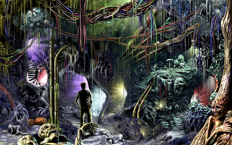
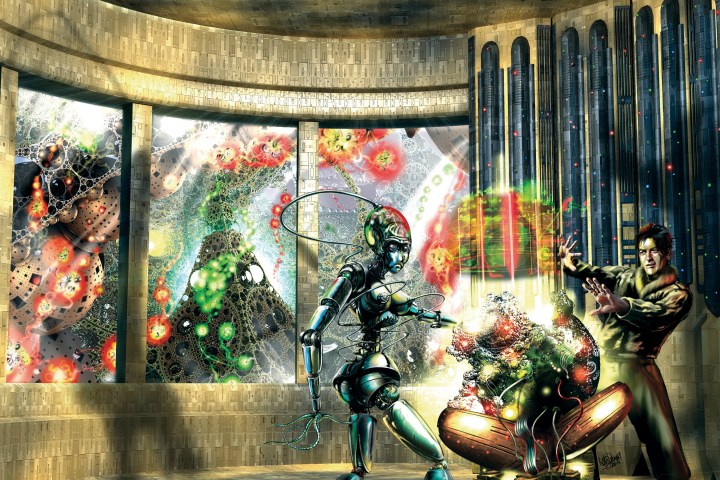
Next is an image I produced for Shades of Vengeance, for their Era: The Consortium role play game. It’s a painting of a “Shade” which is a kind of “high tech super spy” featured in “The Secret War” expansion. The reason I am so happy with it is it represented a major turning point in my handling of light and realism.
And of course, the fact that Todd Lockwood took the trouble to tell me “It’s gorgeous Keith” also makes it stand out for me. When one of your heroes says something like that to you, you don’t forget it. After that I became friends with Todd and I’m hoping to go visit him in the near future.
Finally, there is the cover I did for Richard Tongue’s Operation Damocles which is very close to what I’ve been trying to achieve for years with my starship/outer-space type illustrations.
Kirstie: Your DeviantArt page lists Bugs Bunny as your favourite cartoon character. Why?
Keith: Well because he’s incredibly funny, even the way he was animated, especially in those older cartoons from the 1940s. I like that he’s always turning the tables on people who are trying to get one over on him and his funny quips just break me up. As I got older I realized there is a lot of satire in there too. He always brings a smile to my face.
Kirstie: You do a lot of work for sci-fi and fantasy genre books and comics. What appeals to you about that genre?
Keith: I really enjoy creating images of things we don’t see in everyday life and so these genres are ideal for this since that’s what they are all about. I think the challenge for me is to show that, and yet at the same time, have the viewer feel that there is some connection to them in the image. I try to create a feeling that there is something familiar there that they just can’t put their finger on, something in the emotional or subconscious level, a bit like what the best music does. At least, that’s what I strive to achieve. It’s an attempt to recapture the feelings I had when I first got interested in this kind of work way back in my teens, looking at those book covers in the 70’s.
Kirstie: In 2017, you worked on cover art for the sci-fi novels of Guerin Zand. How did you go about bringing the stories to life?
Keith: Well for the first cover Guerin had a very specific idea. His exact wording was:
“I’ve seen your work for E. M. Foner’s Union Station series and I think your style is exactly what I am looking for.
“I have the concept for what I want, based on an event in the book, and it does include a beautiful woman which I want to be sexy, innocent and funny but not sexual. That is why I think you’re work on Union Station is spot on.”
 His original idea for Child’s Play: A Spaceman’s Story was to have one of the main alien characters posed exactly as I’ve shown her in front of the shuttle, clearly making a joke about humanity’s capabilities, while at the same time looking appealing. The intended impression would be that this is a person who, while they are clearly very advanced and they know it, they can also offer a lot to humanity as a whole and regard humanity with some affection.
So, I read the book. It’s written with very tongue in cheek humour and I can honestly say it’s a very funny and entertaining read, even though it also addresses some very serious issues. Guerin draws parallels between the interaction of men and women, the way the power is constantly shifting, the way they manipulate one another using all the means at their disposal, often including sexual tension, affection and the potential for violence in the mix, and of course the compromises that are formed as a result, to the way the aliens relate and interact with humanity. The aliens also have a tendency to treat humans as beloved children and believe they are guiding humanity to maturity, hence the title.
After reading the book I felt it was important to show more of the science fiction elements of the story on the cover as well, so I added the giant alien shuttles and their even more massive mother ship/city. This way I could reinforce the joke while at the same time teasing other aspects of the story. I produced a layout based on this and Guerin response was:
“I think you nailed it. I was surprised that the shuttles and main ship were included from the book. They look like what I imagined. That’s great.
“I absolutely love the colours. The star scape, the sunrise, her outfit and even the woman’s age, figure and beauty are perfect.”
There were a few minor edits required but it wasn’t difficult to address them and soon after the final piece was created.
With the second book, Punishment: A Spaceman’s Story, we went about it slightly differently. The story is about how the main character thinks he, and possibly the whole of humanity, are being punished for what the aliens consider “bad behaviour”, and the events that follow when he addresses it.

This time Guerin asked me to come up with an idea as he wasn’t really sure what to do for this. He offered some general ideas about humanity being punished like children and explained how there is one character in particular who appears to be behind the punishment. This is the beautiful Julie of the Bree (the controlling alien race) and she is a kind of matriarch.
After I read the book I had a very solid idea of what I wanted to do. I felt the best way to depict her would be from the point of view point of a small child looking up at their mother while being chastised. I thought it would be cool to have her manipulating some kind of holographic control that is connected in some way to the Earth and appears to directly affect it, possibly in a negative way. This is to give the impression of the matriarch is saying, “Now look what you’ve done you silly child!”
And of course, I still needed to include the alien shuttles and the mother ship in the mix which I think help contextualize the story and tie the covers together. With all this in mind I produced the layout and Geurin loved it.
The final image includes a lot of subliminal queues and messages, but the overall theme shows how the Earth is overshadowed by alien influence. The whole thing has a darker, more threatening theme than the first one (just as the book does), yet there is still a strong element of humour and light heartedness in the image to reflect text of the book. I really enjoyed working on this cover since it was quite a challenge.
Kirstie: How do you decide which aspects of the story to use in your cover art to convey an entire book through one image?
Keith: Well it depends. Sometimes the authors have a very specific idea for a cover. I usually ask to read the book anyway and if I think I have a better idea, I work out a layout for both and then let the author decide which they prefer.
Generally, though I read the book and make notes about what I feel will be important to convey, put together a layout and then discuss it with the author. If the book isn’t available I’ll work from a synopsis and discussions with the author.
 However occasionally something different happens. For example, the production of the cover for Richard Tongue’s Shadows in the Sky took an entirely different route.
He contacted me and said, “I was wondering if I could commission another cover, with the title Shadows in the Sky, if that’s okay. As for the cover spec, well, this one is a little different, but I think you might like it. I’m guessing that there’s something you’ve always wanted to do – some piece of sci-fi art you’ve been wanting to work on for a while. So… go ahead and do it. I know that you’ll give me something fantastic; you always do.”
So that was what I did. Back in the 1970’s I’d started a painting of a Dyson sphere but I never got around to finishing it. I had always regretted that so I produced an image of the Alamo encountering a Dyson sphere and based the whole thing on what I remembered of the original layout. This then inspired Richard to begin writing a whole new arc of Alamo story and we began discussing, producing and kick-starting a graphic novel related to these stories.
I’m hoping to be able to start on that project within the next month or so.
Kirstie: You’re currently creating cover art for the crowdfunded superhero anthology Era: The Empowered tabletop RPG. How did you get involved with the campaign?
Keith: For a few years now, I’ve been working with Shades of Vengeance, who produce tabletop roleplaying games. I’ve worked mainly on the graphic design and production of their rule books with some occasional illustration. However, this time around Ed Jowett (the SoV creator, writer and editor) felt that I was ideal to produce the all artwork for this game as well.
So yes, I’m doing the cover, but I’m also producing all the interior illustration, as well as the usual graphic design of the rule book. Over the years we’ve put together some fantastic games including Era: The Consortium which is an epic science fiction roleplaying game, Era: Lyres which I did the cover artwork for and the graphic design, Era: Survival which was a survival horror game, as well as one that will probably be of special interest to your readers: Era: The Chosen. It’s described as “A game that really pulls back the layers of the horror genre and sinks its teeth into a dark universe, with mechanics that help to promote that feeling of “I’m gonna die!”.”
Kirstie: What appeals to you about this project?
Keith: Well with Era: The Empowered, I really get to indulge my love of comic art. I did produce all the art for the original Empowered primer but we decided to update the style this time around. And this rulebook is more than just a primer so it’s going to have a lot more illustration in it too. I’m illustrating specific events in the stories and even designing some of the costumes. It’s hard work but a lot of fun at the same time.
 I think I mentioned earlier the work I’m producing is inspired by my friend Liam Sharpe’s work on the recent Wonder Woman comics so it’s really a challenge to do. When it’s completed I’m looking forward to playing the game with my seven- and nine-year-old daughters, who for some wonderful reason (and it’s really not because of me), also have a great love of superheroes.
I must admit it’s quite an opportunity to be able to design and produce all the graphic artwork for this book as well as producing all the illustration. It’s going to be in the area of 300 pages so something of a tome!
Kirstie: What do you think of the decision to let Kickstarter backers submit their own superhero ideas?
Keith: I think this is a great idea and I’m looking forward to working on this. I’m fortunate when I play such games since I can draw my own characters but it’s not that easy for others. Of course, the backers can also choose to have a story written about their own character and I think offering these things is a great way to enhance the players experience. It looks like it’s popular too because Ed already had to double the amount offered since all the slots were filled right way.
Kirstie: How do you plan to approach such a diverse new superhero universe?
Keith: Well that’s the great thing about working with SOV. They are providing incredible material for me to work from and I get solid guidance from the editorial team. So, all I have to do is produce the best art I am capable of which means things are going really well.
Kirstie: Do you have any advice for aspiring artists?
Keith: Yeah, if you want to make a lot of money learn maths and become a banker, because rock stars of the art world are rare animals. Rarer even than actual rock stars.
But seriously, keep practising, keep producing and share your work as much as possible. Try to find groups and forums where you can get honest criticism and advice and listen to what your peers say. I got an incredible amount of help from the DeviantArt community and made a lot of great friends there. There is also a good market place on that website where you can advertise your work for free and apply for commissions.
And most importantly, as a great man once said, “Never Give Up! Never Surrender!”
We’d like to extend an enormous thank you for Keith to taking the time to share so much of his art and effort. If you’d like to keep up with his work, you can check out his website or follow him on Facebook and Twitter.
If you’re interested in Keith’s latest project Era: The Empowered, you can back the Kickstarter here.
2 Replies to “INTERVIEW: Keith Draws Shares the Secrets of Sci-Fi and Superhero Illustration”