
INTERVIEW WITH AN ARTIST: Agathe Sauvageot On Contrast, Tim Burton, and the Constant Fear of Death
An artist that explores the beauty in death, Agathe Sauvageot is a French illustrator who uses the contrast between black and white to expose the most fundamentally human fears. She creates unique and inspiring pieces, drawing inspiration from everything from religious iconography to Tim Burton’s quirky characters.
In the past year, her renewed efforts to share her art online has seen her explode onto the Instagram art scene. Her art depicts vulnerability and humanity in its rawest forms.
We talked to Agathe to find out how she uses her work to ring such evocative chords.
Kirstie: Tell us about yourself.
Agathe: I’m Agathe Sauvageot, a.k.a Sauvage. A French dark artist born in 1987 and currently based in Paris, France. Belonging to the lowbrow art movement, my work is strongly inspired by occult imagery, Dark Age paintings and religious pictures. I’m lefty and I’m a woman. I don’t like people. My cat’s name is Lord Byron. I’m a graphic designer by day. The Beatles are the best. Heil Satan.
K: How did you get into art?
A: I guess I have always been into art. When I was a kid my mom use to take me and my brothers to the library, to museums and exhibitions. She loved drawing and painting a lot. She had plenty of books about art and drawing techniques. It was something completely natural for me to be interested in this kind of thing because I have been raised in it. I have been drawing since I was a child.
Things intensified in high school because classes are boring so you draw in the margin of your notebooks to escape the boredom. And then I went to Art School for five years to study graphic design. I was not very productive at that time because studies sucked all my creativity. But I drew a little anyway.
In 4th year, a teacher told me that my drawings were shitty and didn’t have meaning. It blocked me and I stopped drawing for a few years. I finished my studies, I became a graphic designer and I started drawing again from time to time. And then I met my boyfriend three years ago. He is really into art and supports me a lot. He’s an amazing artist and he encourages me every day to keep producing things. I started drawing really regularly one year ago when I started my Instagram account.

K: Who were your earliest influences?
A: When I was a child I was obsessed with Tim Burton’s work. Especially the aesthetics of Vincent. I was in 4th grade when I saw this short film. It was broadcast as the opening act of The Nightmare Before Christmas in a small cinema in the city where I lived. I was amazed by the beautiful melancholy of the pictures.
In middle-school I started reading Charles Baudelaire poetry and learned that ugly, death and decay were part of life and could be beautiful. Poetry has had a strong influence on my work since then.
K: Who are your predominant influences now?
A: My work is strongly inspired by occult and alchemical imagery, dark age paintings and religious pictures. I’m fascinated by religious imagery. Death is a recurring theme in religious paintings. It’s everywhere, in each hidden symbol. I love the idea of a cult trying to spread hope by choosing a man dying on a cross as a symbol to represent itself. It is very ironic and yet, it is very accurate. Death will come for us whatever we do. This is the only real certainty we have.
I often use the work of Albrecht Dürer as an inspiration. I love the paintings of Hieronymus Bosch as well. I love the Flemish Renaissance style. I like the way they painted facial expressions. Especially the eyes. Their characters always look jaded, weary or bored. I try to reproduce this particular expression in my drawings.
For modern influences, Bailey Illustration is one of the reason I started my Instagram account. He was the first artist I followed on Instagram, along with Darkerdays Illustration and Godsteeth Illustration. Through their work, I realised that there were people who could really appreciate this kind of art, that there was an audience for that and so people could appreciate my artistic vision too. I love their style, they are all different and unique but they are also simple and straight, direct.
I’m also inspired by artists who are part of the lowbrow movement such as Mark Ryden. I’m amazed by the infinite symbolism he hides in his work and his mastery of oil painting.

K: What is your favourite material to work with?
A: I always work with ink for my linework. It’s the best material to have a deep black color. I use Staedtler Mars Matic pencils, they are made for technical drawing and they are refillable with real ink. I’m really not good with a nib pen so these ink pen are perfect for me and I like these pens because when the ink is dry, it doesn’t fade away when you erase the pencil underneath. I also use Posca pen for filling background or for the red parts of my drawings. I use traditional techniques and I only draw on paper. I own a graphic tablet but I can’t draw with it.
K: If you could design the poster for any movie, what would it be? What would your design be like?
A: I don’t know for the movie but if it were a TV series I would love to design a poster for Carnivàle. This show was superb but HBO canceled it after two great seasons and I still can’t get over it. The show took place in an itinerant freak show during the Great Depression. Every character was perfectly written and the atmosphere was strange and heavy, twisted and mysterious. It’s an amazing show.
Actually, if I could design the poster for a movie it would probably be The Craft. This movie had a huge influence on my teenage years.
K: What is the first piece of work you were really proud of?
A: Like a lot of artists out there, I am rarely proud of my work. Also, I have a lot of difficulties in considering myself an artist. I’m always learning, trying to improve my work and it’s never good enough for me. But sometimes there are moments of grace where I find myself satisfied with my work. So the first piece of work I was really proud of was a piece I made a year ago: Someone’s reason. I was really proud because I finally came with something simple, direct, sexy yet dark and poetic. This is the beginning of my current work.
K: How have you changed as an artist since then?
A: I drop the idea of doing simple drawings with thick lines. I was exploring to find my style back then and I know now that my style is in the details. I like to mix shading lines and dot work to give depth to my drawings. Each of my drawings are built with symbols and hidden meaning and references to literature, poetry, religion, alchemy. One year ago, eroticism was a central theme in my work, now I’m started to give it up for symbolism and occult. Eroticism is still an implicit concept but I’m more into hidden meaning and esoteric references.

K: Your blend of dark themes and cartoony style gives your work a very distinct feel. How did you develop this theme?
A: I always have drawn skulls, skeleton and naked women. Every artist has something he draws when he doesn’t have any inspiration. It’s like our default drawing (like default settings on computers). For me it’s skulls and naked women. I don’t know why, actually. I’m obsessed with death and the fear of dying maybe it’s a hint. I should ask my psychiatrist about that.
When I was a teenager I was a big fan of Buffy the Vampire Slayer (Spike!) and Charmed. I believed in magic and occult because it gives you infinite possibilities and hope that life isn’t just the shitty things you learn in school.
Actually, I think I didn’t develop anything at all, I just draw what I love, what’s part of my personal universe.
K: What inspires your dark, gory pictures?
A: Life. The constant fear of death. The constant hurt of living. The absurdity of the world. I take inspiration everywhere, in the street, in poetry, literature, TV, music… A sentence can trigger something. A melody or even an atmosphere can lead to an idea.
K: You use mostly bold black ink in a lot of your work. What do you like about this art style?
A: First, black doesn’t exist without white. It’s white which gives its boldness to black. I like the strength of black and white contrast. It’s direct, there is no digression. It’s plain black or plain white and yet it is possible to draw an infinity of nuanced meanings only using black ink and white paper.
K: What techniques do you use to get maximum effect out of black lines?
A: For me everything lies in the balance between black and white. We must find the perfect balance. A line or dot in the wrong place can change everything. A black line will have more strength on a white background but more depth if you add it some shading lines or dot. For maximum effect, I try to vary the techniques. It depends on what I want to highlight or bring out.

K: How do you feel your sparing use of colour adds to the impact of each piece?
A: The only colour I use is red, mostly for blood drops here and there. I place these touches of red carefully in the composition to create a path for the eye, to lead the spectator. Also I think it adds to the dramatic atmosphere of the scenes I draw. It’s creates a break, a shock in the composition.
K: What makes you want to draw skulls and skeletons?
A: It’s a tough question and maybe the most common question people ask me. I don’t know actually. I guess skeletons are just regular people but without skin and blood, that’s all. This is what we are under our appearances. This is what remains of us for eternity, it is the most tangible part of our being. My drawings are some kind of memento mori, a constant reminder of death.
K: Your work seems to draw on mythology and occult stories. What draws you to this kind of imagery?
A: I like the strangeness of the symbols and the weird associations that we find in mythology or in occult or even religious imagery. Some pictures give the impression of having no meaning at all yet each element stands for a concept and the whole composition delivers a message.
The most striking example is alchemical imagery. The alchemists did not write their formulas, but drew them in the form of pictures with hidden meanings. Each element of the formula is represented by an animal, a plant, a planet or a symbol. The king is gold, the snake is sulfur, the moon is mercury… If you see a picture of a king in a bathtub on a fire, under the moonlight, it could be a representation of a step in an alchemical formula in which gold (the king) must be heated in a bain-marie (the bathtub on a fire) and melted with mercury (the moon).
It is fascinating. It’s quite the same for religious paintings, they tell us much more than you can actually see.

K: What is your favourite occult story?
A: I don’t know whether we can call that “occult” but I really like folklore stories and legends. I like the ones that imply a pact with the devil and cold death in strange circumstances. There is poetry in this kind of stories. It’s more interesting than tales that end with a lesson to learn. In folklore there is no lesson except that life is a cold bitch and death comes for all of us.
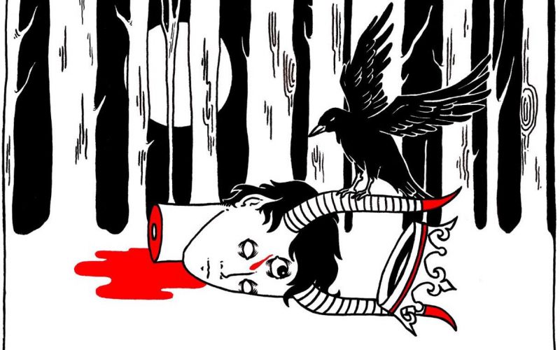
I think my favourite folklore legend is the story of Erlkönig (King of the fairies). Goethe wrote a beautiful poem out of it and Schubert an amazing song (crazy piano part). This has inspired many artists and I refer several times to this story in my work. The story tells of the nocturnal ride of a father and his son into a dark forest, territory of the fairy king. The king wants to kidnap the child and take possession of him. It’s a beautiful dark story.
K: What inspired your tarot card designs?
A: It’s a long-standing project actually. I wanted to do this series for a long time, my own tarot deck, my interpretation of the 22 major arcana of the Tarot of Marseilles. It’s typically the kind of imagery I love, full of symbolism and hidden meanings. I have drawn 5 of them so far, I hope to finish the series by the end of the year. I also have the idea to make a little booklet out of them, maybe I’ll put a few copies on my BigCartel shop as a limited edition.
K: What made you want to mix the macabre with the erotic?
A: I think it was obvious to me, a perfect combination: flesh and bones, the basics of life. There is also a part of easy provocation. For me, eroticism is what we do when we have no inspiration. Even if it’s a central topic, I think we can talk about eroticism without showing it openly. That’s why I’m gradually abandoning this topic for more subtle things. For me, nudity is not erotic. Nudity is showing the fragility of the human being, it is also about honesty.
K: Do you have any advice for aspiring artists?
A: I don’t know whether I am in a good position to give advice but here is what I learned in my little experience as an artist: Talent is nothing without work but work is nothing without ideas. If you look for your style, you will never find it. Stop thinking, just create.
A huge thank you to Agathe for taking the time to talk to us! If you want to see more of her work, you can check out her portfolio on her Tumblr page and follow her on Instagram.
Find out more about Agathe Sauvageot: